UWorld Medical - Exam Prep app for iPhone and iPad
4.4 (
1744 ratings )
Education
Medical
Developer:
UWorld LLC
Free
Current version:
10.6.2, last update: 2 months ago
First release : 20 May 2015
App size: 138.58 Mb
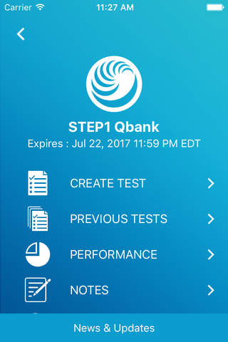
The UWorld Medical test-prep app allows you to access your USMLE® (Step 1, Step 2, Step 3), COMLEX® (Level 1, Level 2), and UKMLA® (AKT) QBanks on your iOS devices. Features include:
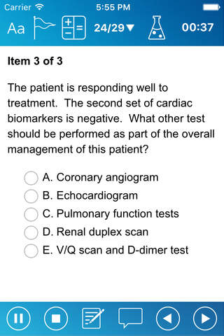
- Thousands of practice questions and concepts at or above your exam’s difficulty level
- In-depth explanations of problems and answer options
- Detailed illustrations to help you visualize medical concepts
- Clinical scenarios that analyze your ability to synthesize and diagnose real-life patient interactions
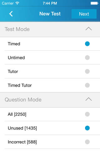
- Customizable content and practice tests that focus on specific clinical rotations or systems
- Active-learning tools like smart flashcards and an all-in-one digital notebook
- Detailed performance tracking to identify and remediate weaknesses
Our goal is to make you a better clinician from day one. Our team of practicing physicians has modeled our questions and explanations after clinical scenarios medical students will encounter on their exams and in their careers. To date, we’ve helped over 2 million US students prepare for their high-stakes exams.
Already have a UWorld Medical subscription? Download the app and log in with your same email address and password.
Any progress you make on the UWorld Medical app will automatically sync across your devices. We recommend connecting to Wi-Fi to download and access your material.
Please contact us at [email protected] for additional support, questions, or feedback.
Build a strong foundation in medicine and ace your licensure exams on your first attempt with UWorld!
Pros and cons of UWorld Medical - Exam Prep app for iPhone and iPad
UWorld Medical - Exam Prep app good for
I love this app because it allows me to practice wherever I am without having to bring a laptop with me.
The only annoying feature is the notification popping up every single time you leave the app or switch to another app. The notification prompts you to either go on with the current test/review or to discard it. It is really annoying, especially when you are using the app on your iPhone and a message or call comes up. After all, if you want to discard the session, there is an accessible button.
Removing or at least giving the choice to opt out of the notification would render the experience much smoother. Thanks!
Im happy to see it looks more like FRED. You guys did a great job with that. The app also works as dependably as the desktop version itself, which is great, but I echo what some people were saying below.
1. Its a bit difficult to navigate, so putting a set of next/back keys closer to the bottom edge would be nice.
- As a subpoint to that, I personally use the left and right arrow keys a lot to navigate questions during review on the desktop version. It would be nice to have that functionality here with bluetooth keyboards.
2. Highlighting is pretty hard too - takes a couple clicks to where I usually just dont bother after a while. A simple drag motion to highlight would be superb.
Overall from loading the test and getting the data are much fasting. My experience is very smooth compare to the old version. Good job guys!
Some bad moments
I want to downgrade to older version please T______T, the new one is very annoying to use on a tab, especially when highlighting or moving around as it takes me to previous or next question!!! Its driving me crazy!!!!!!!!!
-Updated review: I would also like to see the topic of the question blocks in previous test for the mobile version. How am I supposed to know which quiz was which topic when I want to review?
-------------------I preferred how the older version would have the timer start anew every time you restarted a suspended exam so that I knew how much time elapsed during that session as opposed to the total time it takes me to finish all the questions in that question block. :(
-I also do not like how on my iPad the buttons to navigate the questions are on the left-hand side as opposed to how it was originally being at the top
Please fix :(
Make it easier to highlight by just dragging finger over the words. It takes too long to try to highlight as it is now.
Everything about this new user interface is infuriating. Toolbars take up space, buttons in new places, clunkier loading, ugly color scheme, and a huge departure from mimicking the NBME. The lab button rarely works no matter how repeatedly you mash the icon. This mobile app is poorly designed. Listen to your customers and change it back to the original!
I enjoy being able to study with this qbank wherever I want, but please fix the lab values button! Its worked exactly two times for me, despite trying dozens of times.
What happened to this app? The previous design was way better. Now, it has these odd glitches when loading the question numbers and the overall resolution appears worse.
Usually UWorld Medical - Exam Prep iOS app used & searched for
uworld,
uworld usmle,
uworld qbank,
12 steps,
and other. So, download free UWorld Medical - Exam Prep .ipa to run this nice iOS application on iPhone and iPad.


